
Thursday 22 October 2009
Evaluation
College magazine evaluation
In this task, I created a college magazine. I have taken into account the target audience, I have done researching into similar products, shown organisation of models, props, locations and costumes. I have created drafts and a mood board and used digital technology in my presentation.
I have used many conventions of a real magazine, such as the barcode, masthead, cover lines, a selling line. After researching and finding out about these conventions, I was able to use them correctly and make my magazine look professional and effective. I researched music magazines and college magazines and compared them. By this I found out the components to the magazines and what I had to put into mine.
First of all, I created a blog to present all of my work in. Everything that I created (drafts, mood board, ideas etc) all went into my blog. I had many ideas for my name of the college magazine and many ideas for coverlines, so I was alright in choosing them to put onto my front cover.
The strengths of my college magazine front cover is that it would be noticeable to anyone. The fonts and images look effective. I put a glow on my main image to make it stand out and look different. The weaknesses about my magazine cover and that I would have changed is the background, I could have made it relevant to the main image.
The feedback I got from an audience is that it looked professional and that they would definitely buy it. My target audience would obviously be college students, hence the name and the look of my magazine front cover. I have learnt that the components I have used are the ones used by real magazines and looks professional.
Looking at the front cover of my college magazine and looking at the NME magazine that I deconstructed, both the magazines have similar components, like the barcode, selling lines, cover lines and images, but in a different type of genre. The NME magazine is clearly a music magazine looking at the images and the coverlines, compared to my college magazine, the components of mine clearly show that it is a college magazine.
Altogether I used many media technologies in my college magazine construction and the research. This is shown in my drafts and ideas for my magazine front cover and contents page.
Costumes and Props
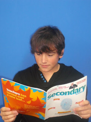
For my main image for my college magazine front cover, I used my good friend, Jacob. I wanted him to look busy and look student-like, like working, listening or reading. I chose his to be sat down, reading a book. For the camera angle, I made sure that it was a meduim close up. The only props I used was the book. The costume, I thought was very relevant because you can tell it's a college student as he isn't wearing uniform. I find that the final photgraph I used, out of the origional three, fitted all the aspects I needed and I felt that the picture looked appropiate and effective but yet simple.

Images
This was the image I used for my front cover of my magazine
 I didn't use this image
I didn't use this image
I didn't use this imageI didn't use this image
Camera Shots

This image shows the types of camera shots that there are.
I will be using a medium close up.
Monday 19 October 2009
Programs I am going to use/have used.
To create my magazine front cover and contents page, I will be using Adobe Photoshop. I am also going to use it to create most of the add before putting it into Microsoft Office Publisher. I find that Photoshop is the best editing program to use and can use it very easily now. I might have used Miscrosoft Publisher but the features are limited and it will take longer. I have used Microsoft Powerpoint to create my computer draft for my front cover and contents page.
Sunday 18 October 2009

Friday 16 October 2009
Components of a magazine front cover
The components;
Masthead: The name of the magazine presented on the front cover.
Dateline: Publication date often shown in months and years, usually contains price too.
Main Image: The largest image shown on the front cover, showing its relation to the main headline and story.
Coverlines: These are at most, a sentence, to explain a story that will feature inside the magazine. They are usually appear smaller (smaller the size, the least importance usually, this applys for the main cover line also). Coverlines sometimes contain small images, obviously relating to the relevant coverline.
Main Cover line: The largest and most visable and outstanding coverline, relating to the main image. Usually takes up a lot of the front cover along with the main image.
Bar code: Standard bar code, on every magazine, used by the retailers.
Selling line: This is a short description of the title's main marketing point, for example Empire magazine's selling line is 'The World's Biggest Movie Magazine'.
Contents page analysis

The purpose of a contents page is to give the reader the bit of information about what is inside the magazine and where to find it. It needs to be simple and easy to read. The colour scheme from the front cover usually remains consistent on the contents page to keep the house style. It splits it’s contents into sections so the readers can find what they are looking for easily. The white background is successful in which it allows the reader to not be distracted and to keep there attention on the text.The big picture of Astoria shows it’s importance and that it’s one of the main features as it appears on the front cover too. It is anchored by the text underneath it. NME also has a ‘Band Index’ on the contents page, this again is for the convenience of the readers that were attracted to the bands listed on the front cover. There are also arrows next to some features which indicate to the reader that these appeared on the front cover. The subscription information in the black banner stands out against the white background to attract readers into possible subscribing.The content inside the red arrow is telling the readers that they will find 'the UK's no1 gig guide' inside the magazine.
Tuesday 13 October 2009

Monday 12 October 2009

college mag, target audience, comparing etc...
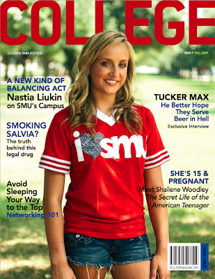
Looking at this college magazine, I have found aspects which I could use in my college magazine. I have researched many college magazines and most of them I have looked at, do not display a price, therefore, I don't think I will have one on my magazine, plus the fact that it is for students and they are not likely to pay for them. I have acknowledged that my college magazine will be for students, studying at college. the font on this is big and bold with colour. I find this very eye catching and is a good idea. This image is the main feature as it is very large and noticable and the red in her top matches the red masthead, this has been deliberately. Tere isn't a main cover line, I feel that this is a disadvantage because the images does not relate to any cover line on the front of the magazine.
Looking at this magazine and then looking at the NME magazine I deconstructed, I have found that a college magazine is to inform and educate. Whereas a music magazine, such as NME is more to entertain and more informal. A college magazine would be more of a 'handout', something that wouldn't really be essential compared to the NME magazine which would be bought out of interest.
Create A Professional Looking Magazine
This will give me a good idea on how to create a professional looking magazine front cover using Photoshop.
deconstructed magazine
 This decontructed NME magazine is one of my most popular music magazines there is. This magazine has all the components you can get, on it. The only thing I have missed is the 'issue number' which, on most magazines, they appear. Everything I have noted on this magazine front cover are usually seen on most magazine front covers and has given me some ideas for my college magazine that I am to create.
Sunday 11 October 2009
researching...
I have been researching to find out about different aspects about college magazines, front covers and contents pages;
http://viewer.zmags.com/showmag.php?mid=whgpsr#/page2/
http://magazinepublishing.suite101.com/article.cfm/how_to_start_a_magazine
http://www.wikihow.com/Create-a-Magazine-Cover-in-Photoshop
http://www.magforum.com/cover_secrets.htm
http://viewer.zmags.com/showmag.php?mid=whgpsr#/page2/
http://magazinepublishing.suite101.com/article.cfm/how_to_start_a_magazine
http://www.wikihow.com/Create-a-Magazine-Cover-in-Photoshop
http://www.magforum.com/cover_secrets.htm

Monday 5 October 2009
Conventions of a contents page
- Images: to show what to expect inside the magazine, some of the articles.
- subheading: the subheading appears under the heading and the page number, this is a little sentance to explain what the article will be about.
- page number: to show where the articles are in the magazine.
- details about the magazine: email, telephone number etc; to contact.
- subheading: the subheading appears under the heading and the page number, this is a little sentance to explain what the article will be about.
- page number: to show where the articles are in the magazine.
- details about the magazine: email, telephone number etc; to contact.
Subscribe to:
Posts (Atom)

