
Monday 14 December 2009
Thursday 10 December 2009
Wednesday 9 December 2009
Tuesday 8 December 2009
Monday 7 December 2009
Friday 4 December 2009
Textual Analysis Contents page 3
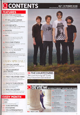 Language: This contents page taken from the music magazine 'Q' has a big main image of the band 'The Courteeners'. The magazine always has the same colour scheme which is red an white and is show again in this contents page. The contents page conventionally features images of bands which appear in the magazine and in this case is a long shot, showing them on a hill. this is the only large image so this shows that this is probably the main storyline or article.
Institution: in the top right hand corner of the contents page you have contact information, which are websites to the Q website.
Ideology: Quite basically, the ideas in which the contents page is trying to portray include the highlighted headings being the highlights of the magazine along with the photos featured on the contents page.
Audience: The audience would most likely be someone looking for a certain article of interest and/or a regular reader of Q magazine. It is difficult to say who the audience will be as it is only the contents page.
Representation: The models on the contents page all look different, interesting and alternative; the style which Q utilises in order to make it stand out amongst the dozens of pop magazines that are out there. Most of them look quite dirty and sweaty which denotates that they're tired and connotates that they have just done a performance or even performed live at a festival.
Textual Analysis Contents page 2
 Language: This contents page has been taken from an issue of the Kerrang magazine. It features many images, most of them are the same size apart from one, which therefore you can tell is the main feature of the contents page. Looking at the main larger image, you can tell that this is a form of rock magazine because of the clothes he is wearing. You can tell he is rebellious from the pose he is doing. So from just looking at one main image you can establish the genre of the magazine, also looking at the other images, they are similar and you get the feel that it is a rock magazine.
Institution: Looking carefully at the magazine, you can see there is a mention of a website for Kerrang just underneath of where the says 'contents'. But apart from this, there is no form of advertisements or any contact information.
Ideology: The way in which the people in the images are portrayed are that they are all 'rockers' and the way they have been shown to is, you can tell that the type of music to expect to be featured is heavy metal and/or rock.
Audience: The audience that would read this magazine would be, obviously music lovers and the genre of music would be heavy metal and/or rock music. The age group for this magazine would range from teenagers to up to about the ages of 40. You wouldn't expect the older generation to be interested in this genre of music.
Representation: The way in which the people on the pictures are represented are, like i have said, are quite rebellious; by the hand gesture shown in the large picture you can tell this.
Textual Analysis Contents page 1
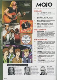 Language: This contents page, taken from an issue of the Mojo magazine, is conventionally split up in to two sections for easy navigation. One side you have images and the other side you have text, the images obviously relate to the text. The contents list itself is placed down the right-hand side of the page, with pictures on the left. This allows the page to look professional whilst being simplistic and not cluttered with boring amounts of text. You see the use of colours such as black white and red used for the font and this is kept consistent throughout the contents page. The main image you would presume is the one at the top because its larger than the others and is at the top. The way the images are placed randomly and are on top of some others reflects on the genre of the magazine, it is rock and rebellious.
Institution: There appears to be no mention of institution on this contents page. This shows that the magazine is confident and feel it is well known enough not to have a mention of the institution on the contents page.
Ideology: This contents page is ideological to the rock and pop genre. The bands situated on the contents page are represented as talented and powerful due to the camera angles. the people situated in all of the images are dressed casually and how most people who like the genre also dress so is ideological of the target audience.
Audience: The audience that would read this magazine would be, obviously music lovers and the genre of music would be rock. The age group for this magazine would range from teenagers to up to about the ages of 40. You wouldn't expect the older generation to be interested in this genre of music.
Representation: The models are represented as quite hard-rocking and professional due to the use of the costume, props, mise-en-scene and camera shot and angle.
Textual Analysis Front Cover 3
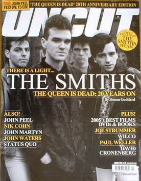
Language: This magazine front cover has been taken from an issue of 'Uncut'. The main image (of The Smiths) is very engaging because you get eye contact from all of the members of the band and this then engaged the audience and drags them in to look at the front cover if the magazine. the camera shot is a Medium shot and therefore shows most of the bodies of the subjects and mainly the faces. You can tell who the dominant one is of the band from the arrangement of the subjects. The masthead is being covered a bit by one of the band members, but does not matter as you still tell what it says. You can tell the genre of the magazine by looking at the colour and the font of the cover lines, they are very simple but yet bold and the genre you get across is a kind of casual/normal rock. The colour scheme for this front cover is clearly yellows and whites, which are effective because they contrast between the black and dark image.
Institution: The institution who makes the magazine is recognisably; Uncut. They are an established institution with a very recognisable masthead. Because the masthead is so recognisable it can have the main image overlapping as people can tell what it is without all of the masthead showing. Apart from the masthead, there is no other mention of the institution (including no visible contact information, including websites or subscription service to the magazine, and there is also no mention of the company that owns and publishes the magazine).
Ideology: This cover is ideological to the rock and pop genre. It gives out the message that rock is simple and laid back, just like the main image. Also the artist on the front creates 'indie' music and the cover lines are all 'indie' related.
Audience: Looking at this magazine front cover, you would say the targeted audience for the Uncut magazine would be from teenagers upward to about the age of 40. It would also obviously be aimed at music lovers too.
Representation: Here, the models; The Smiths, are represented as a very laid back band, they look cool and relaxed in the main image on the front of this magazine. Looking at their costumes and prop and their posture, they are represented as a casual and laid back sort of band. The representation also creates a sense as though if you by the magazine you can be like them if you buy the magazine.
Textual Analysis Front Cover 2
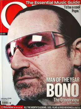 Language: This magazine front cover has been taken from an issue of 'Q'. The main image (of Bono from U2) is very engaging because you get eye contact from the subject and this then engaged the audience and drags them in to look at the front cover if the magazine. The camera shot is a medium shot and therefore shows most of the bodies of the subjects and mainly the faces. The masthead is being covered a lot by Bono's head, but does not matter as you still tell what it says and shows the importance of the masthead and the popularity. You can tell the genre of the magazine by looking at the colour and the font of the cover lines, they are very simple but yet bold and the genre you get across is a kind of casual/normal rock. The colour scheme for this front cover is clearly yellows and whites, which are effective because they contrast between the black and dark image. The main image is the main focus of the front cover and there isn't much writing or many cover lines, this shows that the main image is most important.
Institution: The institution who makes the magazine is recognisably; Q. They are an established institution with a very recognisable masthead. Because the masthead is so recognisable it can have the main image overlapping as people can tell what it is without all of the masthead showing. Apart from the masthead, there is no other mention of the institution (including no visible contact information, including websites or subscription service to the magazine, and there is also no mention of the company that owns and publishes the magazine).
Ideology: This cover is ideological to the rock and pop genre. It gives out the message that rock is simple and laid back, just like the main image. Also the artist on the front creates 'indie' music and the cover lines are all 'indie' related.
Audience: Looking at this magazine front cover, you would say the targeted audience for the Uncut magazine would be from teenagers upward to about the age of 40. It would also obviously be aimed at music lovers too. But with it being Bono, some of the older generation could relate to it also.
Representation: Here, the model; Bono, are represented as a very laid back band, they look cool and relaxed in the main image on the front of this magazine. Looking at their costumes and prop and their posture, they are represented as a casual and laid back sort of person. The representation also creates a sense as though if you by the magazine you can be like them if you buy the magazine.
Textual Analysis Front Cover 1
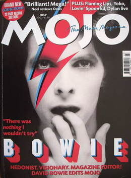
Language: This front cover of the Mojo magazine features the famous singer David Bowie. The image is very bright whereas the background is dark and makes the main image stand out a lot. The way he is positioned is vital to the way the audience see him because it looked like he is coming from out of the dark. The famous 'lightening bold' look that David Bowie has has been shown to be on his and on the front cover as well, so its not just on the pictured person, its on the front of the cover also. The masthead is easy to read and is simple. The main cover lines retains the simple them as this again is in a basic font, is in grey but just in a larger font, this ensures it stands out from the other cover lines however is still very simple.
Institution: The masthead on this cover is very recognisable to the institution which is 'Mojo', it is so recognisable of the institution as it is so original and simple however is different to most magazine mastheads. It is a small masthead just consisting of four letters.
Ideology: This cover is ideological to the rock and pop genre. It is simple, casual but yet still attractive, which is how the rock and pop genre movements are seen to be, this music guides the fans of this genres life because they are casual just like the genre. The band in the main images of magazine often are powerful on how people who like the genre dress, the band are dressed casually and how most people who like the genre also dress so is ideological of the target audience.
Audience: Looking at this magazine front cover, you would say the targeted audience for the Mojo magazine would be from teenagers upward to about the age of 40. It would also obviously be aimed at music lovers too.
Representation: David Bowie is represented in a mysterious way because he is coming from out of the dark. the way he is putting his hand in his mouth shows that he is timid or vulnerable.
Textual Analysis Double page spread 3
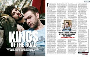
Language: This double-page-spread is from the magazine NME. It is about 'Kings of Leon' and therefore relates to the main headline. The band are dressed casually, this shows that they aren't really bothered about their appears and are laid back. You can tell who is the 'main man' in the band because he is the main focus and is looking at the camera and is also on the right hand side of the page in a smaller image. The font is very simple but yet bold and simple, it is over the top of the main image if this double page spread and therefore works well and is easily legible. The mise-en-scene shows that they are on a sofa and a place that you wouldn't think to take a picture like that. So this is like their dress sense, its laid back and a relaxed environment.
Institution: There is no appearance of institution on this double page spread, which may put the magazine at a disadvantage. The lack of identity on the page means that if you didn't know which article it derived from and you hadn't seen the image and text style from the front cover, you would have no idea which magazine it derives from. There is also, conventionally, no form of advertisements nor is there any contact information.
Ideology: The ideas in which NME is trying to convey is that Kings of Leon are cool and laid back and relaxed by their poses and facial expressions, you can tell this. There is also, conventionally, no form of advertisements and there isn't any contact information.
Audience: Looking at this double page spread, you can identify that the target audience is a young age, like from the age 16 and above. But you can see that there is a lot of writing in this certain article so you would say that the people who would read this would need a big interest in the featured article and in music generally.
Representation: Kings of Leon are represented as an indie band due to their costume, mise-en-scene and the text associated with them. They are also represented as quite rebellious by the way the singer isn't looking directly at the camera lens and also their posture and their facial gestures.
Textual Analysis Double page spead 2
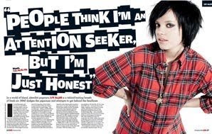
Language: This double-page spread from the NME issue features Lily Allen. She is wearing an iconic costume such as a 'lumberjack' chequered shirt, which is iconic of Indie. Her hair is also black and swept to the side of her face, which is an iconic hairstyle. The make-up she is wearing is also thick black which is iconic. She does, however, keep some part of her girly style by the use of the prop necklace, which allows her to express herself as still girly and not a 'tomboy'. The text is also connotates punk as the iconic punk band 'The Sex Pistols' are often wrote in that font style. She is slightly leaning, connotating that she's a bit tired or fed up, but she is still happy, and has her hands on her waists, allowing the girly side of her to still be seen. The layout of the article remains conventional; minimal text, large dominating image taking up one whole page and a large headline, in this context, in the form of a quote. It then, above the article text, has a small headline to start it off. The colour scheme, reflecting the cover models personality, is red and black, connotating, through mise-en-scene, that she is not as good as she appears to be, she has a darker side and is dangerous (the use of red connotates this). The colour of her costume (shirt) also connotates this as the mise en scene of this is the colour red, mostly dominating the article, and the black lines on her shirt. There is also high, artificial lighting showing her good side.
Institution: There is no appearance of institution on this double page spread, which may put the magazine at a disadvantage. The lack of identity on the page means that if you didn't know which article it derived from and you hadn't seen the image and text style from the front cover, you would have no idea which magazine it derives from. There is also, conventionally, no form of advertisements nor is there any contact information.
Ideology: The ideas in which NME is trying to convey is that Lilly Allen isn't a 'chav' anymore (that was her first image) and is now quite cool and indie. It also shows us that she's quite sexy which is connotates through the use of her costume (shirt) being unbuttoned at the top.
Audience: The target audience is 'indie', style-conscious, UK teenagers from the age roughly 15-25 years of age. They would be in a low class system as they wouldn't have lots of money, but wouldn't necessarily be poor as they would be in to the latest fashion.
Representation: Lilly Allen is represented as a bit of an 'indie/emo' person due to her costume, makeup, and the text associated with her. She is also represented as quite rebellious in the way she, unconventionally, isn't looking directly at the camera lens. This makes the image look professional but not conventional. Social groups such as chavs or 'gangsters' (people who idolise rappers or R&B artists) as these are the styles and forms of music which NME doesn't deal with, and therefore would clash with its overall image. To properly convey what I am trying to say about the text use and The Sex Pistols, here is a poster of them, and note the similarity between the two texts.
Thursday 3 December 2009
Textual Analysis Double page spead 1
 This is a double page spread from the magazine 'Rolling Stone' which features the band, The Killers. This double page spread is mainly, one big image, of all 4 members of the band. The image is in black and white which makes the band's faces whiter and makes them stand out from the page, it also does this with their hands, this is important because they are all making the same shape with their hands a bit like a claw, this could symbolise there attitudes and feelings about music and the hand action could symbolise that they want to get out of the page, therefore could mean that they want to explore music. All the members of the band are looking in different directions however the singer of the band (3rd from the left) is looking directly into the camera, and is more towards the camera than the others behind him. This tells the audience who the singer is and also the eye contact would catch the eyes of the audience therefore bringing them to there attention so that they would read the article.They is very little text on this page, the main headline reads 'The Killers' and 'Inside' below in smaller text. The headline 'The Killers' is the name of the band, which informs the reader about what and who the article is going to be about. It is in big blocked lettering, and is the biggest text on the page, and the most important.
Tuesday 1 December 2009
Camera Angles/Shots
Links
I have been reseaching about how to create a magazine front cover and how to do it on certain programmes likes 'Adobe PhotoShop. Also a have looked at and found out about some of the terms of a magazine front cover. Here are some links to the pages a have found out information about on...
http://www.wikihow.com/Create-a-Magazine-Cover-in-Photoshop
http://www.magforum.com/cover_secrets.htm
http://www.ehow.co.uk/how_2247023_create-magazine-photoshop.html?cr=1
http://www.wikihow.com/Create-a-Magazine-Cover-in-Photoshop
http://www.magforum.com/cover_secrets.htm
http://www.ehow.co.uk/how_2247023_create-magazine-photoshop.html?cr=1
My target audience
My target audience for the music magazine will be;
- People who enjoy music and music related issues
- Specifically the genres rock and pop
- Aimed towards 15 - 40 year olds
- Aimed at both sexes
- Available to anyone who could afford it. (between 2-4 pounds an issue)
With this target audience I hope that I will be able to cater most of peoples musical needs. I will be presenting my magazine in a fashion that will suit the age group that I am aiming for and will try to reperesent it in a way that it will appeal to bot males and females.
Subscribe to:
Posts (Atom)


