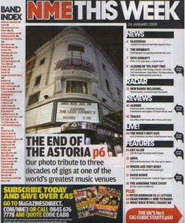
The purpose of a contents page is to give the reader the bit of information about what is inside the magazine and where to find it. It needs to be simple and easy to read. The colour scheme from the front cover usually remains consistent on the contents page to keep the house style. It splits it’s contents into sections so the readers can find what they are looking for easily. The white background is successful in which it allows the reader to not be distracted and to keep there attention on the text.The big picture of Astoria shows it’s importance and that it’s one of the main features as it appears on the front cover too. It is anchored by the text underneath it. NME also has a ‘Band Index’ on the contents page, this again is for the convenience of the readers that were attracted to the bands listed on the front cover. There are also arrows next to some features which indicate to the reader that these appeared on the front cover. The subscription information in the black banner stands out against the white background to attract readers into possible subscribing.The content inside the red arrow is telling the readers that they will find 'the UK's no1 gig guide' inside the magazine.


No comments:
Post a Comment