
Monday 14 December 2009
Thursday 10 December 2009


Wednesday 9 December 2009


Tuesday 8 December 2009

Monday 7 December 2009
My music magazine second draft
 I think I am going to take a new picture, I'm not happy with this one as it is a bit blurred
Friday 4 December 2009
My music magazine first draft
 I am going to change the font of the masthead to make it appeal to my target audience as it is between 16 and 40 year olds. I will change the background and the colour of the main cover line as well.
Textual Analysis Contents page 3
 Language: This contents page taken from the music magazine 'Q' has a big main image of the band 'The Courteeners'. The magazine always has the same colour scheme which is red an white and is show again in this contents page. The contents page conventionally features images of bands which appear in the magazine and in this case is a long shot, showing them on a hill. this is the only large image so this shows that this is probably the main storyline or article.
Institution: in the top right hand corner of the contents page you have contact information, which are websites to the Q website.
Ideology: Quite basically, the ideas in which the contents page is trying to portray include the highlighted headings being the highlights of the magazine along with the photos featured on the contents page.
Audience: The audience would most likely be someone looking for a certain article of interest and/or a regular reader of Q magazine. It is difficult to say who the audience will be as it is only the contents page.
Representation: The models on the contents page all look different, interesting and alternative; the style which Q utilises in order to make it stand out amongst the dozens of pop magazines that are out there. Most of them look quite dirty and sweaty which denotates that they're tired and connotates that they have just done a performance or even performed live at a festival.
Textual Analysis Contents page 2
 Language: This contents page has been taken from an issue of the Kerrang magazine. It features many images, most of them are the same size apart from one, which therefore you can tell is the main feature of the contents page. Looking at the main larger image, you can tell that this is a form of rock magazine because of the clothes he is wearing. You can tell he is rebellious from the pose he is doing. So from just looking at one main image you can establish the genre of the magazine, also looking at the other images, they are similar and you get the feel that it is a rock magazine.
Institution: Looking carefully at the magazine, you can see there is a mention of a website for Kerrang just underneath of where the says 'contents'. But apart from this, there is no form of advertisements or any contact information.
Ideology: The way in which the people in the images are portrayed are that they are all 'rockers' and the way they have been shown to is, you can tell that the type of music to expect to be featured is heavy metal and/or rock.
Audience: The audience that would read this magazine would be, obviously music lovers and the genre of music would be heavy metal and/or rock music. The age group for this magazine would range from teenagers to up to about the ages of 40. You wouldn't expect the older generation to be interested in this genre of music.
Representation: The way in which the people on the pictures are represented are, like i have said, are quite rebellious; by the hand gesture shown in the large picture you can tell this.
Textual Analysis Contents page 1
 Language: This contents page, taken from an issue of the Mojo magazine, is conventionally split up in to two sections for easy navigation. One side you have images and the other side you have text, the images obviously relate to the text. The contents list itself is placed down the right-hand side of the page, with pictures on the left. This allows the page to look professional whilst being simplistic and not cluttered with boring amounts of text. You see the use of colours such as black white and red used for the font and this is kept consistent throughout the contents page. The main image you would presume is the one at the top because its larger than the others and is at the top. The way the images are placed randomly and are on top of some others reflects on the genre of the magazine, it is rock and rebellious.
Institution: There appears to be no mention of institution on this contents page. This shows that the magazine is confident and feel it is well known enough not to have a mention of the institution on the contents page.
Ideology: This contents page is ideological to the rock and pop genre. The bands situated on the contents page are represented as talented and powerful due to the camera angles. the people situated in all of the images are dressed casually and how most people who like the genre also dress so is ideological of the target audience.
Audience: The audience that would read this magazine would be, obviously music lovers and the genre of music would be rock. The age group for this magazine would range from teenagers to up to about the ages of 40. You wouldn't expect the older generation to be interested in this genre of music.
Representation: The models are represented as quite hard-rocking and professional due to the use of the costume, props, mise-en-scene and camera shot and angle.
Textual Analysis Front Cover 3

Language: This magazine front cover has been taken from an issue of 'Uncut'. The main image (of The Smiths) is very engaging because you get eye contact from all of the members of the band and this then engaged the audience and drags them in to look at the front cover if the magazine. the camera shot is a Medium shot and therefore shows most of the bodies of the subjects and mainly the faces. You can tell who the dominant one is of the band from the arrangement of the subjects. The masthead is being covered a bit by one of the band members, but does not matter as you still tell what it says. You can tell the genre of the magazine by looking at the colour and the font of the cover lines, they are very simple but yet bold and the genre you get across is a kind of casual/normal rock. The colour scheme for this front cover is clearly yellows and whites, which are effective because they contrast between the black and dark image.
Institution: The institution who makes the magazine is recognisably; Uncut. They are an established institution with a very recognisable masthead. Because the masthead is so recognisable it can have the main image overlapping as people can tell what it is without all of the masthead showing. Apart from the masthead, there is no other mention of the institution (including no visible contact information, including websites or subscription service to the magazine, and there is also no mention of the company that owns and publishes the magazine).
Ideology: This cover is ideological to the rock and pop genre. It gives out the message that rock is simple and laid back, just like the main image. Also the artist on the front creates 'indie' music and the cover lines are all 'indie' related.
Audience: Looking at this magazine front cover, you would say the targeted audience for the Uncut magazine would be from teenagers upward to about the age of 40. It would also obviously be aimed at music lovers too.
Representation: Here, the models; The Smiths, are represented as a very laid back band, they look cool and relaxed in the main image on the front of this magazine. Looking at their costumes and prop and their posture, they are represented as a casual and laid back sort of band. The representation also creates a sense as though if you by the magazine you can be like them if you buy the magazine.
Textual Analysis Front Cover 2
 Language: This magazine front cover has been taken from an issue of 'Q'. The main image (of Bono from U2) is very engaging because you get eye contact from the subject and this then engaged the audience and drags them in to look at the front cover if the magazine. The camera shot is a medium shot and therefore shows most of the bodies of the subjects and mainly the faces. The masthead is being covered a lot by Bono's head, but does not matter as you still tell what it says and shows the importance of the masthead and the popularity. You can tell the genre of the magazine by looking at the colour and the font of the cover lines, they are very simple but yet bold and the genre you get across is a kind of casual/normal rock. The colour scheme for this front cover is clearly yellows and whites, which are effective because they contrast between the black and dark image. The main image is the main focus of the front cover and there isn't much writing or many cover lines, this shows that the main image is most important.
Institution: The institution who makes the magazine is recognisably; Q. They are an established institution with a very recognisable masthead. Because the masthead is so recognisable it can have the main image overlapping as people can tell what it is without all of the masthead showing. Apart from the masthead, there is no other mention of the institution (including no visible contact information, including websites or subscription service to the magazine, and there is also no mention of the company that owns and publishes the magazine).
Ideology: This cover is ideological to the rock and pop genre. It gives out the message that rock is simple and laid back, just like the main image. Also the artist on the front creates 'indie' music and the cover lines are all 'indie' related.
Audience: Looking at this magazine front cover, you would say the targeted audience for the Uncut magazine would be from teenagers upward to about the age of 40. It would also obviously be aimed at music lovers too. But with it being Bono, some of the older generation could relate to it also.
Representation: Here, the model; Bono, are represented as a very laid back band, they look cool and relaxed in the main image on the front of this magazine. Looking at their costumes and prop and their posture, they are represented as a casual and laid back sort of person. The representation also creates a sense as though if you by the magazine you can be like them if you buy the magazine.
Textual Analysis Front Cover 1

Language: This front cover of the Mojo magazine features the famous singer David Bowie. The image is very bright whereas the background is dark and makes the main image stand out a lot. The way he is positioned is vital to the way the audience see him because it looked like he is coming from out of the dark. The famous 'lightening bold' look that David Bowie has has been shown to be on his and on the front cover as well, so its not just on the pictured person, its on the front of the cover also. The masthead is easy to read and is simple. The main cover lines retains the simple them as this again is in a basic font, is in grey but just in a larger font, this ensures it stands out from the other cover lines however is still very simple.
Institution: The masthead on this cover is very recognisable to the institution which is 'Mojo', it is so recognisable of the institution as it is so original and simple however is different to most magazine mastheads. It is a small masthead just consisting of four letters.
Ideology: This cover is ideological to the rock and pop genre. It is simple, casual but yet still attractive, which is how the rock and pop genre movements are seen to be, this music guides the fans of this genres life because they are casual just like the genre. The band in the main images of magazine often are powerful on how people who like the genre dress, the band are dressed casually and how most people who like the genre also dress so is ideological of the target audience.
Audience: Looking at this magazine front cover, you would say the targeted audience for the Mojo magazine would be from teenagers upward to about the age of 40. It would also obviously be aimed at music lovers too.
Representation: David Bowie is represented in a mysterious way because he is coming from out of the dark. the way he is putting his hand in his mouth shows that he is timid or vulnerable.
Textual Analysis Double page spread 3

Language: This double-page-spread is from the magazine NME. It is about 'Kings of Leon' and therefore relates to the main headline. The band are dressed casually, this shows that they aren't really bothered about their appears and are laid back. You can tell who is the 'main man' in the band because he is the main focus and is looking at the camera and is also on the right hand side of the page in a smaller image. The font is very simple but yet bold and simple, it is over the top of the main image if this double page spread and therefore works well and is easily legible. The mise-en-scene shows that they are on a sofa and a place that you wouldn't think to take a picture like that. So this is like their dress sense, its laid back and a relaxed environment.
Institution: There is no appearance of institution on this double page spread, which may put the magazine at a disadvantage. The lack of identity on the page means that if you didn't know which article it derived from and you hadn't seen the image and text style from the front cover, you would have no idea which magazine it derives from. There is also, conventionally, no form of advertisements nor is there any contact information.
Ideology: The ideas in which NME is trying to convey is that Kings of Leon are cool and laid back and relaxed by their poses and facial expressions, you can tell this. There is also, conventionally, no form of advertisements and there isn't any contact information.
Audience: Looking at this double page spread, you can identify that the target audience is a young age, like from the age 16 and above. But you can see that there is a lot of writing in this certain article so you would say that the people who would read this would need a big interest in the featured article and in music generally.
Representation: Kings of Leon are represented as an indie band due to their costume, mise-en-scene and the text associated with them. They are also represented as quite rebellious by the way the singer isn't looking directly at the camera lens and also their posture and their facial gestures.
Textual Analysis Double page spead 2

Language: This double-page spread from the NME issue features Lily Allen. She is wearing an iconic costume such as a 'lumberjack' chequered shirt, which is iconic of Indie. Her hair is also black and swept to the side of her face, which is an iconic hairstyle. The make-up she is wearing is also thick black which is iconic. She does, however, keep some part of her girly style by the use of the prop necklace, which allows her to express herself as still girly and not a 'tomboy'. The text is also connotates punk as the iconic punk band 'The Sex Pistols' are often wrote in that font style. She is slightly leaning, connotating that she's a bit tired or fed up, but she is still happy, and has her hands on her waists, allowing the girly side of her to still be seen. The layout of the article remains conventional; minimal text, large dominating image taking up one whole page and a large headline, in this context, in the form of a quote. It then, above the article text, has a small headline to start it off. The colour scheme, reflecting the cover models personality, is red and black, connotating, through mise-en-scene, that she is not as good as she appears to be, she has a darker side and is dangerous (the use of red connotates this). The colour of her costume (shirt) also connotates this as the mise en scene of this is the colour red, mostly dominating the article, and the black lines on her shirt. There is also high, artificial lighting showing her good side.
Institution: There is no appearance of institution on this double page spread, which may put the magazine at a disadvantage. The lack of identity on the page means that if you didn't know which article it derived from and you hadn't seen the image and text style from the front cover, you would have no idea which magazine it derives from. There is also, conventionally, no form of advertisements nor is there any contact information.
Ideology: The ideas in which NME is trying to convey is that Lilly Allen isn't a 'chav' anymore (that was her first image) and is now quite cool and indie. It also shows us that she's quite sexy which is connotates through the use of her costume (shirt) being unbuttoned at the top.
Audience: The target audience is 'indie', style-conscious, UK teenagers from the age roughly 15-25 years of age. They would be in a low class system as they wouldn't have lots of money, but wouldn't necessarily be poor as they would be in to the latest fashion.
Representation: Lilly Allen is represented as a bit of an 'indie/emo' person due to her costume, makeup, and the text associated with her. She is also represented as quite rebellious in the way she, unconventionally, isn't looking directly at the camera lens. This makes the image look professional but not conventional. Social groups such as chavs or 'gangsters' (people who idolise rappers or R&B artists) as these are the styles and forms of music which NME doesn't deal with, and therefore would clash with its overall image. To properly convey what I am trying to say about the text use and The Sex Pistols, here is a poster of them, and note the similarity between the two texts.
Thursday 3 December 2009

Textual Analysis Double page spead 1
 This is a double page spread from the magazine 'Rolling Stone' which features the band, The Killers. This double page spread is mainly, one big image, of all 4 members of the band. The image is in black and white which makes the band's faces whiter and makes them stand out from the page, it also does this with their hands, this is important because they are all making the same shape with their hands a bit like a claw, this could symbolise there attitudes and feelings about music and the hand action could symbolise that they want to get out of the page, therefore could mean that they want to explore music. All the members of the band are looking in different directions however the singer of the band (3rd from the left) is looking directly into the camera, and is more towards the camera than the others behind him. This tells the audience who the singer is and also the eye contact would catch the eyes of the audience therefore bringing them to there attention so that they would read the article.They is very little text on this page, the main headline reads 'The Killers' and 'Inside' below in smaller text. The headline 'The Killers' is the name of the band, which informs the reader about what and who the article is going to be about. It is in big blocked lettering, and is the biggest text on the page, and the most important.
Tuesday 1 December 2009
Camera Angles/Shots
 For my magazine front cover I am to use a Medium Close Up (MCU)
Like this image (left). For a Medium Close Up, I will need from the shoulders upwards and getting the head as the main subject
Links
I have been reseaching about how to create a magazine front cover and how to do it on certain programmes likes 'Adobe PhotoShop. Also a have looked at and found out about some of the terms of a magazine front cover. Here are some links to the pages a have found out information about on...
http://www.wikihow.com/Create-a-Magazine-Cover-in-Photoshop
http://www.magforum.com/cover_secrets.htm
http://www.ehow.co.uk/how_2247023_create-magazine-photoshop.html?cr=1
http://www.wikihow.com/Create-a-Magazine-Cover-in-Photoshop
http://www.magforum.com/cover_secrets.htm
http://www.ehow.co.uk/how_2247023_create-magazine-photoshop.html?cr=1
My target audience
My target audience for the music magazine will be;
- People who enjoy music and music related issues
- Specifically the genres rock and pop
- Aimed towards 15 - 40 year olds
- Aimed at both sexes
- Available to anyone who could afford it. (between 2-4 pounds an issue)
With this target audience I hope that I will be able to cater most of peoples musical needs. I will be presenting my magazine in a fashion that will suit the age group that I am aiming for and will try to reperesent it in a way that it will appeal to bot males and females.
Friday 27 November 2009

Thursday 26 November 2009

Tuesday 17 November 2009
Conventions of a magazine front cover


Q; Like most magazines, 'Q' magazine has a large main image that takes up the majority of the front of the magazine.
NME; The main image is of a popular music artist (Florence Welsh from Florence and the Machine), So immediately you can identify the genre of the magazine because of the main image.MOJO; The main image of the front cover of the Mojo magazine, like the Q and the NME front covers, takes up the majority of the cover. You instantly see the image and then relates to music. Unlike the other magazines that I have looked at, this one is very plain in colour.
Masthead:
Q; 'Q' - here we see a very big and bold masthead that stands out. The colours used are very effective, but yet simple and help make it eye catching.
NME; the NME magazine's masthead is very large and bold. Out of the three mastheads i have looked at, this is the best one I would say because it stands out a lot.
MOJO; Like the NME magazine, you can't really see much of the name of the magazine. But this doesn't matter because if you were only to see a bit of it, then you can easily identify what magazine it is with it being so popular.
Selling Line:
Q; 'A different take on music' - This stating this to show that the magazine is about music. If the saw the masthead, you wouldn't really relate it with music, so the Selling Line makes it obvious on what the magazine is about.
NME; 'National Music Express' - Looking at the Selling Line, you can again identify that this is a music magazine. The Selling Line tells you what the name of the magazine means. So if you were to pick up this magazine and see the Masthead, you wouldn't really identify it as a music magazine but then when you see the Selling Line, you know what kind of the genre the magazine is going to be about.
MOJO; 'Music Magazine' - this selling is simple and to the point. The masthead doesn't really explain what the magazine is about so the Selling Line is there for the audience to identify what the magazine's genre is.
Main cover line:
Q; 'Lily Allen & her wicked, wicked ways' - the main cover line, I would say, is very eye catching with the bold and outstanding. Also, the main cover line is keeping a consistent house style with the different colours of the words; black, white and red are the main colours of this magazine front cover.
NME; 'Florence takes America, 72 hours with the world's greatest export' - Now looking at this Main cover line, it relates to the main image. Looking at this main cover line compared to Q's, NME's stands out a lot more with it being a bold colour and a big bold font. This, I feel, is very eye catching.
MOJO; 'The Smiths, Their rise, Their fall' - The main cover line is in a plain font and doesn't stand out. It is the same colour as the rest of the text on that front cover and therefore is not at all eyecatching. You can tell that it is the main cover line by the size and where it is.
Cover lines:
Q; At the bottom of the 'Q' magazine front, there are cover lines in the form of a banner. I feel that this is very clever and effective as it saves a lot of space but yet is still very noticeable. There are cover lines in the top right hand corner of the front cover which, like the main cover line, keep the same colour consistency, maybe to make the writing recognisable and make the viewers relate them colours to the 'Q' magazine.
NME; The cover lines are like the main cover line, a main headline in red and a little sentence underneath it that is in white. So not only is it just giving you a headline about what some articles are going to be about, it gives you a bit of information with it, for example it could be a quote.
MOJO; I would say that the cover lines stand out more than the main cover line. that all have a white box around the white writing therefore making out eye catching and outstanding.
Bar code:
Q; the bar code is in a very common place on this magazine front cover, in the space that the bar code is in is also the date and the issue number of the magazine. They do this because everything is in the same place and you know where they are.
NME; like in the Q magazine, the bar code is in a very common place. The bar code has been placed so that it isnt covering any of the main image on the front of the magazine.
MOJO; like the other two magazines that i have looked at, the bar code is in the bottom right hand corner so as the audience knwo where to look for it and the price, issue number etc
Monday 16 November 2009

Language
The components;
Masthead: The name of the magazine presented on the front cover.
Dateline: Publication date often shown in months and years, usually contains price too.
Main Image: The largest image shown on the front cover, showing its relation to the main headline and story.
Coverlines: These are at most, a sentence, to explain a story that will feature inside the magazine. They are usually appear smaller (smaller the size, the least importance usually, this applys for the main cover line also). Coverlines sometimes contain small images, obviously relating to the relevant coverline.
Main Cover line: The largest and most visable and outstanding coverline, relating to the main image. Usually takes up a lot of the front cover along with the main image.
Bar code: Standard bar code, on every magazine, used by the retailers.
Selling line: This is a short description of the title's main marketing point, for example Empire magazine's selling line is 'The World's Biggest Movie Magazine'.
LIIAR
LIIAR (Key Concepts)
L - Language- the wording and Terminology used in a piece of Media. The language and terms have to be appropriate to the piece. For instance, a college magazine would have to use terms relevant to education and teaching.
I - Institution- quite simply is the company/organisation which produces the media. For instance, Kerrang!, which produces both Kerrang! music channel and Kerrang! magazine. Both of which are highly popular.
I - Ideology- Individual concepts which pieces of media try to get across. These can be expressed both explicitly and Implicitly. These concepts could be anything from stereotyping to trying to make a product 'sexy' and attractive, such as the perfume my induction task was based on.
A - Audience- The type of audience the piece of Media attracts. This is vitaly important as it is attracting the right audience. For instance. college magazines have to attract an audience which consists of both teachers and students. Mainstream magazines try to be as aesthetically pleasing to everyone as possible.
R - Representation- How the concepts of Ideology are put forward. For instance the perfume is represented by colours that have the connotation of 'love'- Red, Pink, Purple. This is a concept which people recognise easily.
Thursday 12 November 2009


Wednesday 11 November 2009
Action Plan
I must do...
BriefDefine LIIARConventions of music mag front covers, both in music and non music magsIT drafts;front cover,contents page,double spreadHand drafts;front cover,contents page,double spreadMind mapMood boardTextual analysis; 3 front covers,3 contents pages,3 double page spreadsPlanning;Camera shots,name,audience,cover stories etcTarget Audience.VideosLinksFront CoverContents PageDouble Page Spread- Evaluation. (Organisation- Models, location, costume, props, angle.)
Monday 9 November 2009
LIIAR
L - Language: The language is the terminology used for the components of a magazine, such as; masthead, cover lines, main image, selling line, bar code, main cover line.
I - Institution: Companies, like TV channels, magazines, radio stations.
I - Ideology: This is the idea of what the magazine would be selling. The things that are included in something that makes it important, like the idea that ideology for a fashion magazine will be fashion and the ideology of a music magazine is music.
A - Audience: The target audience for a music magazine would usually be aimed at men ages over 18.
R - Representation: Represents a certain something or someone. Like how we see a character in a TV drama or in a film. It is the way you see something, the way it is represented.
The Brief
Preliminary exercise: using DTP and an image manipulation program, produce the front page of a new school/college magazine, featuring a photograph o a student in medium close-up plus appropriately laid-out text and a masthead. Additionally you must produce a mock-up of the layout connects page to demonstrate their grasp of DTP.
Main Task: the font page and double page spread of a new music magazine. All images the text used must be original, produced by you - minimum of four images.
Presentation Of Work: The presentation of the research, planning and evaluation may take the form of any one, or combination of two or more, of the following:- A presentation using slide show software such as
- A PowerPoint;
- A blog;
- A podcast;
Thursday 22 October 2009

Evaluation
College magazine evaluation
In this task, I created a college magazine. I have taken into account the target audience, I have done researching into similar products, shown organisation of models, props, locations and costumes. I have created drafts and a mood board and used digital technology in my presentation.
I have used many conventions of a real magazine, such as the barcode, masthead, cover lines, a selling line. After researching and finding out about these conventions, I was able to use them correctly and make my magazine look professional and effective. I researched music magazines and college magazines and compared them. By this I found out the components to the magazines and what I had to put into mine.
First of all, I created a blog to present all of my work in. Everything that I created (drafts, mood board, ideas etc) all went into my blog. I had many ideas for my name of the college magazine and many ideas for coverlines, so I was alright in choosing them to put onto my front cover.
The strengths of my college magazine front cover is that it would be noticeable to anyone. The fonts and images look effective. I put a glow on my main image to make it stand out and look different. The weaknesses about my magazine cover and that I would have changed is the background, I could have made it relevant to the main image.
The feedback I got from an audience is that it looked professional and that they would definitely buy it. My target audience would obviously be college students, hence the name and the look of my magazine front cover. I have learnt that the components I have used are the ones used by real magazines and looks professional.
Looking at the front cover of my college magazine and looking at the NME magazine that I deconstructed, both the magazines have similar components, like the barcode, selling lines, cover lines and images, but in a different type of genre. The NME magazine is clearly a music magazine looking at the images and the coverlines, compared to my college magazine, the components of mine clearly show that it is a college magazine.
Altogether I used many media technologies in my college magazine construction and the research. This is shown in my drafts and ideas for my magazine front cover and contents page.
Costumes and Props
For my main image for my college magazine front cover, I used my good friend, Jacob. I wanted him to look busy and look student-like, like working, listening or reading. I chose his to be sat down, reading a book. For the camera angle, I made sure that it was a meduim close up. The only props I used was the book. The costume, I thought was very relevant because you can tell it's a college student as he isn't wearing uniform. I find that the final photgraph I used, out of the origional three, fitted all the aspects I needed and I felt that the picture looked appropiate and effective but yet simple.

Images
This was the image I used for my front cover of my magazine
 I didn't use this image
I didn't use this image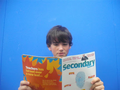
I didn't use this imageI didn't use this image
Camera Shots

This image shows the types of camera shots that there are.
I will be using a medium close up.
Monday 19 October 2009
Programs I am going to use/have used.
To create my magazine front cover and contents page, I will be using Adobe Photoshop. I am also going to use it to create most of the add before putting it into Microsoft Office Publisher. I find that Photoshop is the best editing program to use and can use it very easily now. I might have used Miscrosoft Publisher but the features are limited and it will take longer. I have used Microsoft Powerpoint to create my computer draft for my front cover and contents page.
Sunday 18 October 2009

Friday 16 October 2009
Components of a magazine front cover
The components;
Masthead: The name of the magazine presented on the front cover.
Dateline: Publication date often shown in months and years, usually contains price too.
Main Image: The largest image shown on the front cover, showing its relation to the main headline and story.
Coverlines: These are at most, a sentence, to explain a story that will feature inside the magazine. They are usually appear smaller (smaller the size, the least importance usually, this applys for the main cover line also). Coverlines sometimes contain small images, obviously relating to the relevant coverline.
Main Cover line: The largest and most visable and outstanding coverline, relating to the main image. Usually takes up a lot of the front cover along with the main image.
Bar code: Standard bar code, on every magazine, used by the retailers.
Selling line: This is a short description of the title's main marketing point, for example Empire magazine's selling line is 'The World's Biggest Movie Magazine'.
Masthead: The name of the magazine presented on the front cover.
Dateline: Publication date often shown in months and years, usually contains price too.
Main Image: The largest image shown on the front cover, showing its relation to the main headline and story.
Coverlines: These are at most, a sentence, to explain a story that will feature inside the magazine. They are usually appear smaller (smaller the size, the least importance usually, this applys for the main cover line also). Coverlines sometimes contain small images, obviously relating to the relevant coverline.
Main Cover line: The largest and most visable and outstanding coverline, relating to the main image. Usually takes up a lot of the front cover along with the main image.
Bar code: Standard bar code, on every magazine, used by the retailers.
Selling line: This is a short description of the title's main marketing point, for example Empire magazine's selling line is 'The World's Biggest Movie Magazine'.
Contents page analysis

The purpose of a contents page is to give the reader the bit of information about what is inside the magazine and where to find it. It needs to be simple and easy to read. The colour scheme from the front cover usually remains consistent on the contents page to keep the house style. It splits it’s contents into sections so the readers can find what they are looking for easily. The white background is successful in which it allows the reader to not be distracted and to keep there attention on the text.The big picture of Astoria shows it’s importance and that it’s one of the main features as it appears on the front cover too. It is anchored by the text underneath it. NME also has a ‘Band Index’ on the contents page, this again is for the convenience of the readers that were attracted to the bands listed on the front cover. There are also arrows next to some features which indicate to the reader that these appeared on the front cover. The subscription information in the black banner stands out against the white background to attract readers into possible subscribing.The content inside the red arrow is telling the readers that they will find 'the UK's no1 gig guide' inside the magazine.
Tuesday 13 October 2009

Monday 12 October 2009

college mag, target audience, comparing etc...
Looking at this college magazine, I have found aspects which I could use in my college magazine. I have researched many college magazines and most of them I have looked at, do not display a price, therefore, I don't think I will have one on my magazine, plus the fact that it is for students and they are not likely to pay for them. I have acknowledged that my college magazine will be for students, studying at college. the font on this is big and bold with colour. I find this very eye catching and is a good idea. This image is the main feature as it is very large and noticable and the red in her top matches the red masthead, this has been deliberately. Tere isn't a main cover line, I feel that this is a disadvantage because the images does not relate to any cover line on the front of the magazine.
Looking at this magazine and then looking at the NME magazine I deconstructed, I have found that a college magazine is to inform and educate. Whereas a music magazine, such as NME is more to entertain and more informal. A college magazine would be more of a 'handout', something that wouldn't really be essential compared to the NME magazine which would be bought out of interest.
Create A Professional Looking Magazine
This will give me a good idea on how to create a professional looking magazine front cover using Photoshop.
deconstructed magazine
 This decontructed NME magazine is one of my most popular music magazines there is. This magazine has all the components you can get, on it. The only thing I have missed is the 'issue number' which, on most magazines, they appear. Everything I have noted on this magazine front cover are usually seen on most magazine front covers and has given me some ideas for my college magazine that I am to create.
Sunday 11 October 2009
researching...
I have been researching to find out about different aspects about college magazines, front covers and contents pages;
http://viewer.zmags.com/showmag.php?mid=whgpsr#/page2/
http://magazinepublishing.suite101.com/article.cfm/how_to_start_a_magazine
http://www.wikihow.com/Create-a-Magazine-Cover-in-Photoshop
http://www.magforum.com/cover_secrets.htm
http://viewer.zmags.com/showmag.php?mid=whgpsr#/page2/
http://magazinepublishing.suite101.com/article.cfm/how_to_start_a_magazine
http://www.wikihow.com/Create-a-Magazine-Cover-in-Photoshop
http://www.magforum.com/cover_secrets.htm

Monday 5 October 2009
Conventions of a contents page
- Images: to show what to expect inside the magazine, some of the articles.
- subheading: the subheading appears under the heading and the page number, this is a little sentance to explain what the article will be about.
- page number: to show where the articles are in the magazine.
- details about the magazine: email, telephone number etc; to contact.
- subheading: the subheading appears under the heading and the page number, this is a little sentance to explain what the article will be about.
- page number: to show where the articles are in the magazine.
- details about the magazine: email, telephone number etc; to contact.
Monday 28 September 2009
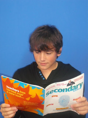
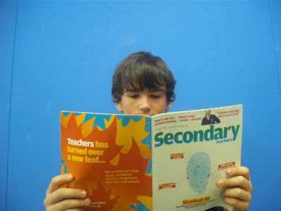
Codes and Conventions of the 'Secondary Teachers' Magazine
-big plain simple title
-date and website displayed
-the audience for this magazine would be teachers, therefore, over 18s
-there is no price which indicates that the magazine doesn't cost anything
-the main image is big and therefore eyecatching, this also shows that the image is the main focus in that magazine
-shows other arcticles which you would expect to read about inside
LIIAR:
Language: The language is relevant to the intended audience, or who the magazine is going to appeal to. The masthead has to be relevant to the reader, like the magazine Secondary Teachers, "Secondary Teachers" is extremely relevant to the occupation of the intended reader, a secondary school teacher. The language is also relevant to the genre of the magazine. The language on the cover and in the actual inside content has to be appealing to all readers and possible new customers. This information is key to a good magazine, as the wrong language for a genre of magazine may result in loss of appeal to the current market. I will have to do research into this at a later date when producing my college magazine.-
Institution: Unknown.
Ideology: The ideology of a college magazine are the values. For "secondary teachers" the values are teaching and education. When i produce my magazine i will have to research into ideology for the genre of my college magazine, and the audience it is aimed at.-
Audience: The audience is very important, as this is who you will be selling your magazine to, who it will be aimed at. Without an audience the magazine is pointless. The cover of the magazine has to be presented in a way to attract the audience. Images, language and layout is all key to attracting the right audience for your magazine. This again will be something I am going to research for my magazine.-
Representation: Representation is shown throughout media in many ways. Everything is represented my something, a way it works, or something it does distinctively. In a college magazine, students will be portrayed as good hard working students. Not misbehaving bad students.
Brief
Priliminary exercise: using DTP and an image manipulation program, produce the front page of a new school/college magazine, featuring a photograph o a student in medium close-up plus appropriatly liad-out text and a masthead. Additionally you must produce a mock-up of the layout connects page to demonstrate their grasp of DTP.
Main Task: the fornt page and double page spread of a new music magazine. All images the text used must be origonal, produced by you - minimum of four images.
Presentation Of Work: The presentation of the reseacrh, planning and evaluationmay take the form of any one, or combination of two or more, of the following:
- A presentation using slideshow softwaresuch as Powerpoint;
- A blog;
- A podcast;
Subscribe to:
Posts (Atom)

