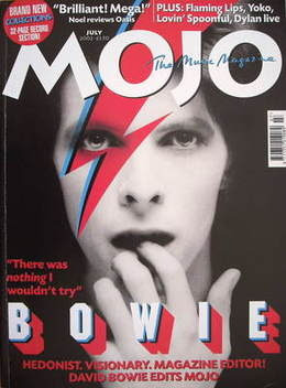
Language: This front cover of the Mojo magazine features the famous singer David Bowie. The image is very bright whereas the background is dark and makes the main image stand out a lot. The way he is positioned is vital to the way the audience see him because it looked like he is coming from out of the dark. The famous 'lightening bold' look that David Bowie has has been shown to be on his and on the front cover as well, so its not just on the pictured person, its on the front of the cover also. The masthead is easy to read and is simple. The main cover lines retains the simple them as this again is in a basic font, is in grey but just in a larger font, this ensures it stands out from the other cover lines however is still very simple.
Institution: The masthead on this cover is very recognisable to the institution which is 'Mojo', it is so recognisable of the institution as it is so original and simple however is different to most magazine mastheads. It is a small masthead just consisting of four letters.
Ideology: This cover is ideological to the rock and pop genre. It is simple, casual but yet still attractive, which is how the rock and pop genre movements are seen to be, this music guides the fans of this genres life because they are casual just like the genre. The band in the main images of magazine often are powerful on how people who like the genre dress, the band are dressed casually and how most people who like the genre also dress so is ideological of the target audience.
Audience: Looking at this magazine front cover, you would say the targeted audience for the Mojo magazine would be from teenagers upward to about the age of 40. It would also obviously be aimed at music lovers too.
Representation: David Bowie is represented in a mysterious way because he is coming from out of the dark. the way he is putting his hand in his mouth shows that he is timid or vulnerable.


No comments:
Post a Comment