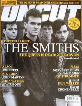
Language: This magazine front cover has been taken from an issue of 'Uncut'. The main image (of The Smiths) is very engaging because you get eye contact from all of the members of the band and this then engaged the audience and drags them in to look at the front cover if the magazine. the camera shot is a Medium shot and therefore shows most of the bodies of the subjects and mainly the faces. You can tell who the dominant one is of the band from the arrangement of the subjects. The masthead is being covered a bit by one of the band members, but does not matter as you still tell what it says. You can tell the genre of the magazine by looking at the colour and the font of the cover lines, they are very simple but yet bold and the genre you get across is a kind of casual/normal rock. The colour scheme for this front cover is clearly yellows and whites, which are effective because they contrast between the black and dark image.
Institution: The institution who makes the magazine is recognisably; Uncut. They are an established institution with a very recognisable masthead. Because the masthead is so recognisable it can have the main image overlapping as people can tell what it is without all of the masthead showing. Apart from the masthead, there is no other mention of the institution (including no visible contact information, including websites or subscription service to the magazine, and there is also no mention of the company that owns and publishes the magazine).
Ideology: This cover is ideological to the rock and pop genre. It gives out the message that rock is simple and laid back, just like the main image. Also the artist on the front creates 'indie' music and the cover lines are all 'indie' related.
Audience: Looking at this magazine front cover, you would say the targeted audience for the Uncut magazine would be from teenagers upward to about the age of 40. It would also obviously be aimed at music lovers too.
Representation: Here, the models; The Smiths, are represented as a very laid back band, they look cool and relaxed in the main image on the front of this magazine. Looking at their costumes and prop and their posture, they are represented as a casual and laid back sort of band. The representation also creates a sense as though if you by the magazine you can be like them if you buy the magazine.


No comments:
Post a Comment