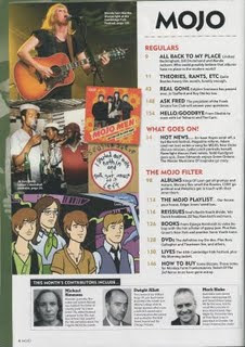
 Language: This contents page, taken from an issue of the Mojo magazine, is conventionally split up in to two sections for easy navigation. One side you have images and the other side you have text, the images obviously relate to the text. The contents list itself is placed down the right-hand side of the page, with pictures on the left. This allows the page to look professional whilst being simplistic and not cluttered with boring amounts of text. You see the use of colours such as black white and red used for the font and this is kept consistent throughout the contents page. The main image you would presume is the one at the top because its larger than the others and is at the top. The way the images are placed randomly and are on top of some others reflects on the genre of the magazine, it is rock and rebellious.
Institution: There appears to be no mention of institution on this contents page. This shows that the magazine is confident and feel it is well known enough not to have a mention of the institution on the contents page.
Ideology: This contents page is ideological to the rock and pop genre. The bands situated on the contents page are represented as talented and powerful due to the camera angles. the people situated in all of the images are dressed casually and how most people who like the genre also dress so is ideological of the target audience.
Audience: The audience that would read this magazine would be, obviously music lovers and the genre of music would be rock. The age group for this magazine would range from teenagers to up to about the ages of 40. You wouldn't expect the older generation to be interested in this genre of music.
Representation: The models are represented as quite hard-rocking and professional due to the use of the costume, props, mise-en-scene and camera shot and angle.


No comments:
Post a Comment